A dashboard is an information management tool that visually displays metrics and data points to track the status of tasks, projects and workflow processes.
The DocMinder® Dashboard is a graphical user interface tool that provides you with a snapshot overview of your data in pie-chart and bar-graph visualizations.
The Dashboard provides an overall status of tasks, projects and workflows that help simplify complex data into manageable, digestible chunks of information.
To access; click on Dashboard from the top navigation bar.

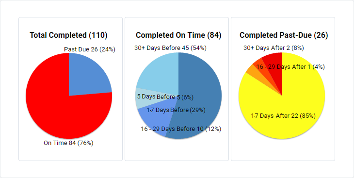
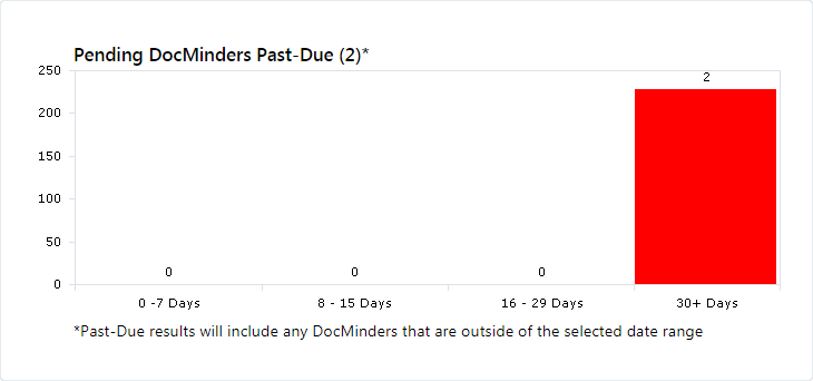
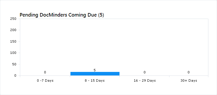
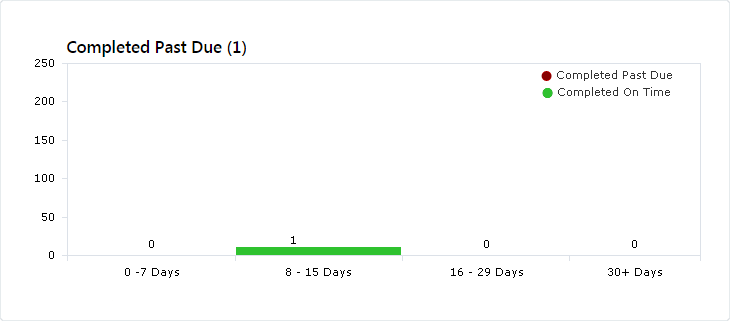
Displays (%) by status (e.g., past-due, completed and pending) for all tasks you're assigned to.
Pending Coming Due displays tasks that are incomplete with an approaching due-date
See the current status of your tasks and projects as well as longer term trends in a visual dashboard created from your data.
Filter your dashboard by a specific date; click on the Start Date.
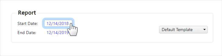
The top-panel will display options to view by Date Range, Period or Time Span.
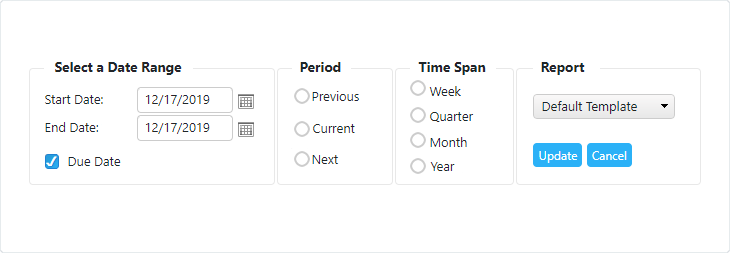
| Filter Type | Description |
|---|---|
| Date Range | Filter your view by selecting a Start Date and End Date. |
| Period | Filter by Time Span with options to view Next, Current or Previous. |
| Time Span | Filter by Period with options to view Week, Month, Year or Quarter. |
| Report | Click Update to save your dashboard view. |
The Dashboard Report allows you to quickly view reporting data in a graphical representation of bar-graphs and pie-charts.
Dashboard reports are easily configurable to allow users to quickly view the information that is most important to them.
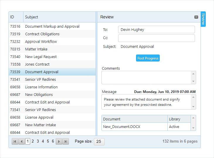
To access the dashboard report; click on a Pie-Chart or Bar-Chart division. A thin blue border appears around the clicked division.
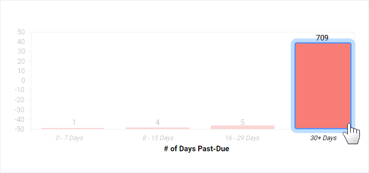
All tasks and projects for the selected division are displayed in a report.
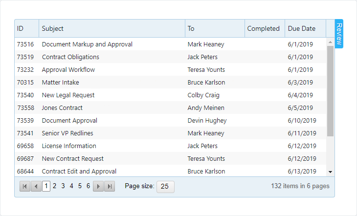
Select an item from the Report, then click the Review tab to display the panel.