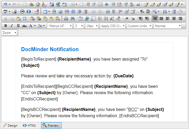
DocMinder® Email Designer is a powerful WYSIWYG (What You See Is What You Get) HTML editor allowing users to author and manage HTML content as easily as writing a document.
In its familiar Microsoft Word like interface users can seamlessly format text, set hyperlinks, build tables insert images, and much more.
- Supports XHTML and HTML specifications and structural features.
- View, edit and produce content in HTML mode.
- Alternatives for supported image formats.
- Generates out-of-the box XHTML compliant markup.
- Change the presentation within editing views without affecting the document markup.
- Ability to zoom the content without affecting the produced XHTML.
- Content appearance can be changed by external CSS style sheets.
- Option to display text elements, instead of a generic marker .
- Edit the content without going to HTML mode.
- Edit all properties of each element and object in an accessible fashion.
- Specify Alt Text and long description for images.
- Directly modify properties/attributes of a selected element in Design mode.
- Tag specific context menus to access the properties/attributes of a selected element.
- Define their own custom tags or attributes.
- Search within editing views.
From the user profile menu; select Web Admin.
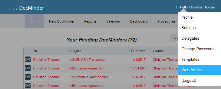
You can access the email designer from a web-browser by following the steps below:
- Open New Browser Tab or Window;
- Type Web-Admin URL (If you do not have this information, contact your Administrator)
- Press Enter;

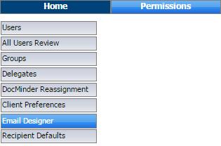
Once the web-admin page displays, navigate to the email designer by clicking Permissions (top-horizontal menu) and then click Email Designer (left-vertical menu).
This page displays a list all email templates currently available in your system. Each template is a single HTML file built using the Email Designer.
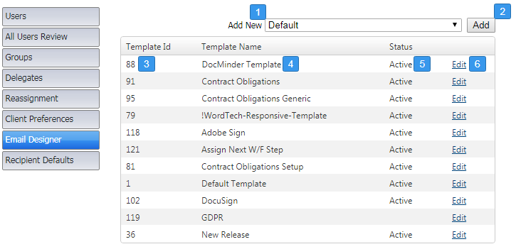
| 1 | Select an email template from the dropdown. |
|---|---|
| 2 | Click to Add the selected template from the dropdown. |
| 3 | Email template ID. |
| 4 | Template name. |
| 5 | Status of the email template Active = being used; *blank = not being used.). |
| 6 | Edit link allows you to view and modify the email template. |
Click on Edit to open up the designer and view the selected email template.
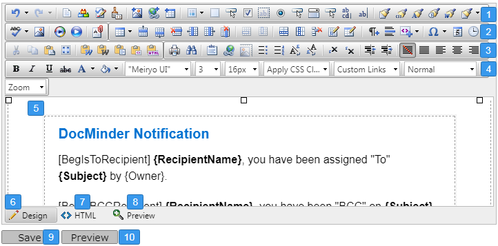
| 1 | Toolbar 1 Controls and Functions are covered in a separate section below. |
|---|---|
| 2 | Toolbar 2 Controls and Functions are covered in a separate section below. |
| 3 | Toolbar 3 Controls and Functions are covered in a separate section below. |
| 4 | Toolbar 4 Controls and Functions are covered in a separate section below. |
| 5 | Editor; this is where you will design, edit and modify email template content. |
| 6 | Design view button allows you to edit with WYSIWYG capabilities. |
| 7 | HTML view button displays HTML markdown. |
| 8 | Preview button displays a preview of the email template. |
| 9 | Save button; click to save any changes you made. |
| 10 | Preview button; click to see the template in a full browser window. |
Conditional blocks act much the same way that merge fields do in that their use is dependent upon the recipient data available in the email message.
Conditional blocks can also save time by allowing one email message to contain different content for different recipients that would otherwise have to be sent in multiple emails.
Conditional Blocks are sections of text that are inserted into a DocMinder® email notification based on a conditional statement.
If the condition is “True”, a particular section of text will be inserted into the email.
If the condition is “False”, the text will not be inserted.
Conditional Operator symbols consist of square and curly brackets with text.
- [ Square brackets ] define the start and end of data.
- { Curly brackets } are data placeholders.

When recipients receive their email the conditional blocks are replaced by actual data.

To change the font color, name, size and background-color; click on the respective button from the toolbar.

To align text left, right, center, or justified; as well as indentation, click on the respective button from the toolbar.

Predefined paragraph styles are used to ease the process of formatting paragraphs.
To apply a paragraph style to text, first place the cursor within the text, then from the paragraph styles dropdown, select the style you want to apply.

Copying and pasting formatted text from MS-Word, Internet Explorer, Google Chrome, or other applications, is pretty straightforward.
The Email Designer introduces a number of tools that help users paste formatted text from Microsoft Word or other applications, and apply different types of format stripping.
Using the Paste Button or ctrl + v
Paste content from Word by using the paste button  or press ctrl + v.
A dialog box will ask you if the Word markup should be cleaned. If the content does not come from Word, the dialog will not be shown.

Paste from Word button
To strip MS-Word formatting (<o:p>, .mso and other tags) from the copied MS-Word content before pasting it into the Designer, click Paste From Word button. 
Paste from Word, Strip Font Button
When pasting MS-Word content by clicking on Paste From Word, Clean Fonts the Designer will clean unnecessary MS-office related tags plus font formatting. 
Paste Plain Text
When pasting MS-Word content by clicking on the Paste Plain Text button it removes all HTML formatting and pastes as plain text, preserving the line breaks. 
Paste as HTML
Allows you to paste HTML content as code, which may be quite convenient for developer-oriented applications (e.g., support systems, forums, etc.). 
The pasted text will look something like this:
<img alt="#" src="designer-logo.gif"> <span style="font-family: Arial">
The Paste HTML dialog allows you to paste HTML code into the designer and render it. It is helpful when you need to enter predefined HTML code such as media embed source.
- Click the
 icon to launch the dialog
 - Paste the HTML content that you want to render into the content area.
- Click Paste
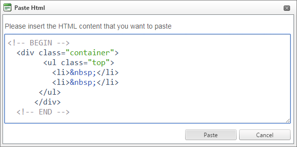
Paste Content in Non-Internet Explorer (IE) Browsers
When the Designer is used with Firefox, Opera, Safari and Google Chrome and any of the paste events discussed above, a new dialog window appears.
This is due to browser restrictions that prohibit accessing content from the clipboard.
To copy and paste content, use ctrl + c and ctrl + v keyboard shortcuts.
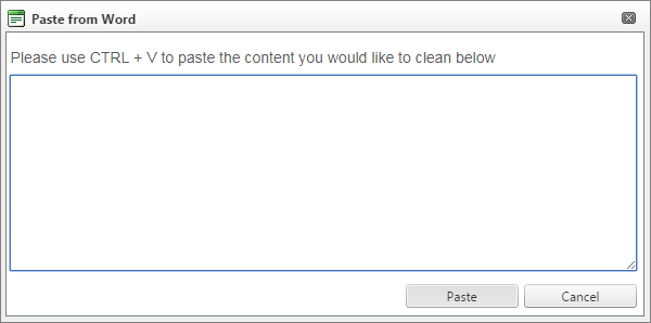
A hyperlink is a word, phrase, or image that you can click on to jump to a new document or a new section within the current document.
- Select the text or object that you want to set as a hyperlink.
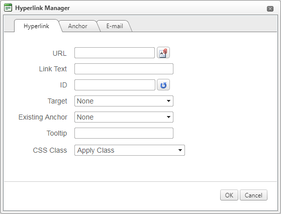
- Click the [Hyperlink Manager] button
 . The Hyperlink Manager dialog appears.
 - In the URL field, enter the web address the link should point to.
- ~Optional~ Fill the Link Text field if you want to specify the text of the link.
- ~Optional~ Select a target for the link.
- ~Optional~ Tooltips will appear when the mouse is placed over hyperlinks.
- Click [OK]
- Select the text object that you want to set as a hyperlink.
- Click the [Insert Link Dialog] button to open the dialog
 .
. - In the URL field, enter the web address that you want the link to point to.
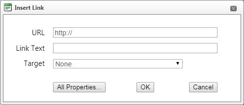
- ~Optional~ Fill the Link Text field if you want to specify the text of the link,
- ~Optional~ Select a target for the link.
- ~Optional~ Click All Properties to set additional hyperlink properties.
- Click [OK]
- Click inside the hyperlink (or in the image if you have an image link)
- Click the [Insert Link Dialog] button
 to open the dialog.
 - Modify the hyperlink attributes (URL, Link Text, etc.) and click [OK].
- Select the text or image that has been set as a hyperlink.
- Click [Remove Link]
 .
.
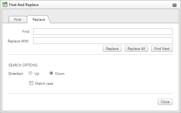
To find (and subsequently replace) a word or passage of text, click on the  button from the toolbar to reveal the dialog.
The dialog provides options such as search direction, scope, match case, etc.
- Select a range of content (e.g., image, table, etc.).
- Click [Find and Replace] or press ctrl + f to open the dialog.
- Type the word or abstract of text you want to search for in the Find field.
- (Replace) Enter the text you want to replace it with in the Replace field.
- (Replace) Choose other options like search direction, scope, etc.
~NOTE~ If you have replaced text with the Replace or Replace All functions by mistake, you can click [Cancel] and the replacement will be undone.
To confirm the replacement click [OK].
The email designer offers two ways for creating tables. The best approach in each particular situation depends on your preferences and the table complexity.
For simpler tables we recommend the click-and-drag Table Builder, whereas, for more complex tables the Table Wizard is more appropriate.
- Position the cursor where you want to create the table.
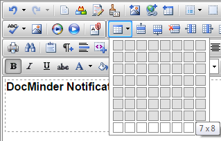
- Click the [Insert Table]
 button on the email designer toolbar.
 - Drag the mouse cursor to select the number of rows and columns you want.
- Position the cursor where you want to create the table.
- Click the [Insert Table]
 button from the toolbar.
 - Click the [All Properties] button at the bottom left of the dialog.
- Click
 or
or  next to Column and Row to remove.
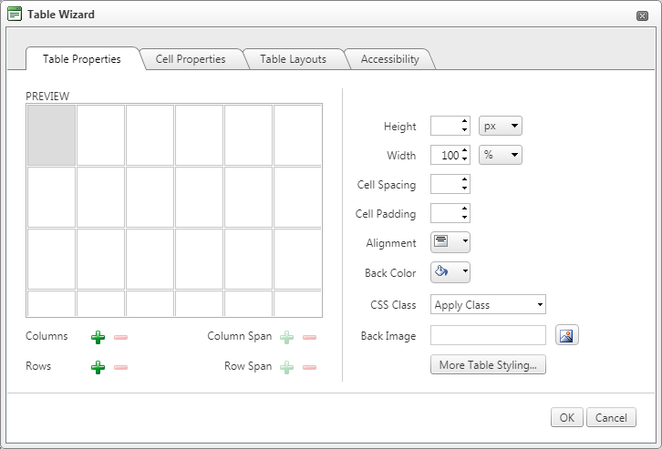
The Table Properties dialog allows you to fine-tune the appearance of a new or existing table. You can reach the [Table Properties] tab in either of the following ways.
- From the Insert Table dialog, click the [Insert Table]
 button from the toolbar.
 - Click All Properties... button.
- From the table wizard dialog, click Table Properties tab.
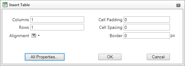

When the Table Properties are visible, you can set the appearance of the table. This involves setting one or more of the following table properties:
| Table Property | Description |
|---|---|
| Width/Height | Specifies the height and the width of the table (in pixels or percent). |
| Background | Sets the background color of the table. |
| Alignment | Aligns the table to the left, center or right side of the page. |
| Cell Spacing | Increases or decreases the space between the borders of the cells. |
| Cell Padding | Increases or decreases the space between the content and the border of the cell. |
| Border | Includes setting border width, color and layout. |
| ID | Setting an ID for a table gives some options for advanced table handling. |
| Background Image | Sets an image as the table background. |
| CSS Class | Specifies table CSS class and style. (For advanced users and developers) |
| Style Builder | Provides options to define cascading style sheet (CSS) style attributes. A CSS style combines individual formatting and positioning attributes into a set that you can apply all at one time. |
After you add a table, you may want to modify cell properties. The cell properties dialog will display options to change and modify height, width, alignment, and more.
To access table cell properties, do the following:
- Click the Insert Table
 button from the toolbar.
 - From the insert table dialog, click on the All Properties... button.
- From the table wizard dialog, click Cell Properties tab.


Cell Properties Explained:
| Cell Property | Description |
|---|---|
| Width/Height | Specifies the height and width of the selected cell (in pixels or percent). |
| Content Alignment | Aligns the content within the selected cell, vertically and horizontally. |
| Background (Color) | Changes the background color of the selected cell. |
| Background Image | Sets an image as the cell background. |
| Style Builder | Provides options to define cascading style sheet (CSS) style attributes. A CSS style combines individual formatting and positioning attributes into a set that you can apply all at one time. |
| ID | Setting an ID for a cell gives options for some better cell handling. (For advanced users and developers) |
| No Wrapping | Enables/disables text wrapping (i.e., forces a new line when text reaches the Cell Border). |
| CSS Class | Specifies cell CSS class and style. (For advanced users and developers) |
Once you have created a table, you can easily add or delete rows and columns - to do this, right-click inside a table or cell to display the context menu.
To Insert a Row, do the following:
- Place the cursor in the row on top or beneath where you want to insert a new row.
- From the toolbar, select the Insert Row Above/below button.

To delete rows or columns; place the cursor in a row/column and select Delete Row/Column button from the toolbar.
To Merge a Cell with the adjacent cell, do the following:
- Select the cell.
- From the toolbar, select the Merge Cell Horizontally/Vertically button.
To Split a Cell, do the following:
- Select the cell.
- From the toolbar, select the Split Cell Horizontally/Vertically button.

Table styles provide an easy and consistent way to format tables.
In order to apply table styles, you have to first create the table and then open the Table Properties dialog to apply a predefined table style.
To Apply Table Style, do the following:
- Right-click the table and select Table Properties from the context menu.
- From the Table Wizard dialog; select Table Layout tab.
- Select a table style from the dropdown located on the right.
- Click [OK] to apply.
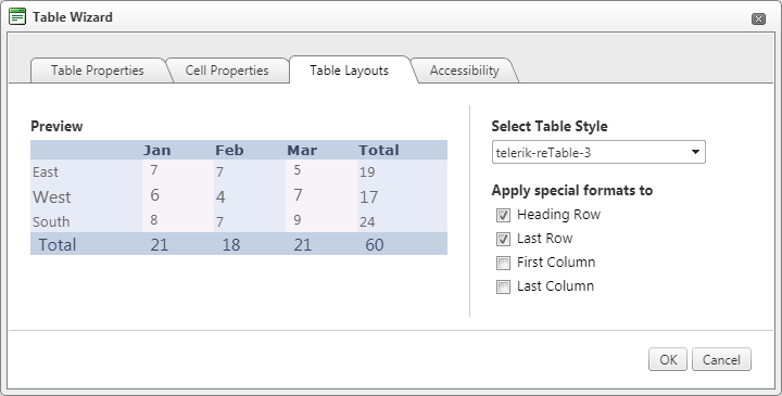
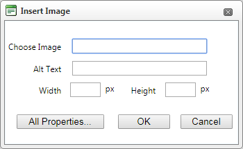
Image Manager allows you to browse through folders located on a web-server. The folders that you have access are pre-set by the site administrator.
The Image Manager allows you to perform the following tasks:
- Browse folders and files
- Select multiple files
- Sort files by name and type
- Preview images, zoom in and out
- Upload new images to the server
- Generate thumbnails of the uploaded images
- Create new sub-folders
- Position the cursor at the place where you need to insert the image.
- Click the [Image Manager]
 button from the toolbar. A dialog box appears.
 - Type in the web-address of the image into the Choose Image textbox field.
- Click [OK] to insert the image.
When an image is inserted, you can manage its properties by a single right click, and then select Properties from the context menu.
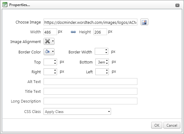
Image Properties Explained:
| Image Property | Description |
|---|---|
| Width | Specifies a custom width for the image (you can constrain the proportions to avoid distortion). The image is not resampled or modified, but rather displayed with specified width. |
| Height | Specifies a custom field for the image (you can constrain the proportions to avoid distortion). The image is not resampled or modified, but rather displayed with the specified height. |
| Image Alignment | Specifies the alignment of the image, with respect to the adjacent text/images. When you choose left or right alignment, the text wraps around the image. |
| Border Color | Specifies the color of the image border. |
| Border Width | Specifies width (thickness) of the image border. Select “NO BORDER” to remove the border. |
| Margin | Specifies the margin (distance to the top, to the left, to the right and to the bottom) between the image and the adjacent text/images. |
| Image alt-text | Specifies the alternative text that is displayed in some cases instead of the image. |
| Title Text | Specifies the title for the image. |
| Long Description | This is an Accessibility option. The text entered in the “Long Description” field will be read by the Windows Narrator tool. |
| CSS Class | Specifies image CSS class and style. Only advanced users should use this property. |
In some scenarios, you may want to position an image absolutely. This will make the image float freely so you can move it around the content with the mouse.
To set absolute positioning, select the image and click the [Set Absolute Position]  button from the toolbar.
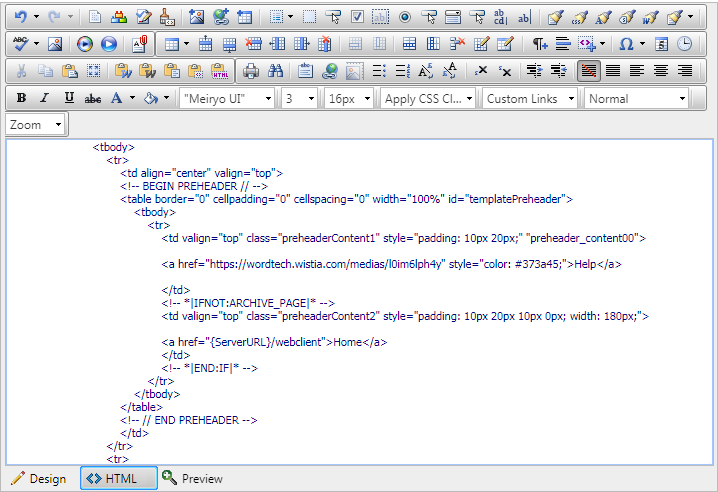
More advanced users sometimes need to modify the HTML code of the content directly. For this reason, the designer provides an “HTML” mode that gives you access to the code.
To view HTML mode click the HTML button located in the bottom-left of the editor.
After editing, you may want to see a preview before updating the page. To see in Preview mode; click the Preview button located in the bottom-left of the editor.
